Getflywheel
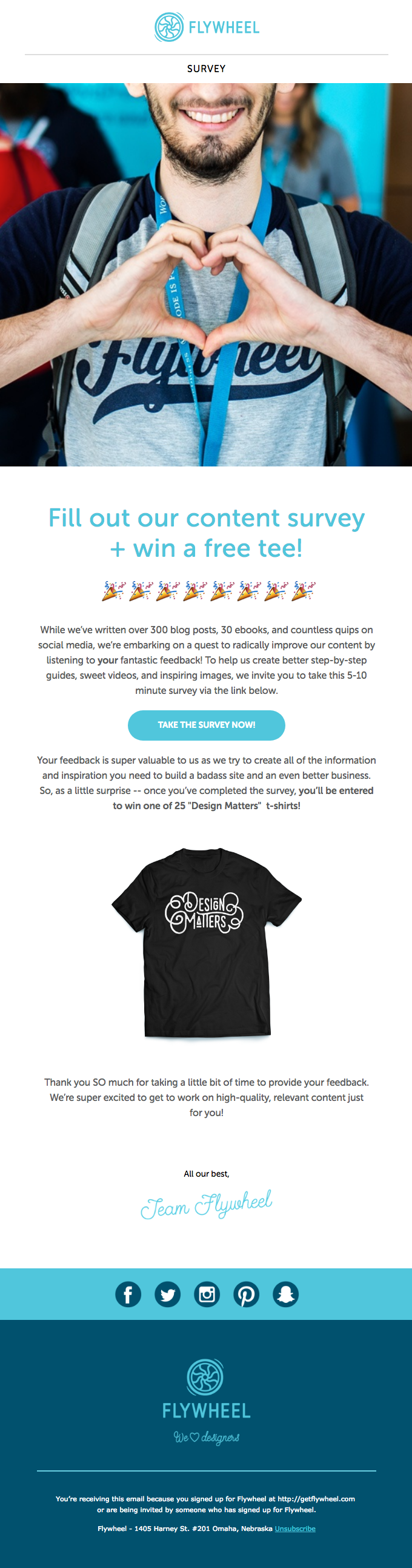
Flywheel emails are always beautiful and overly large. I don’t think I’ve ever seen another brand use such a massive header image. It gets your attention and forces you to scroll down, where you are met with clear copy and a great blue CTA. Adding a picture of the perk for submitting is
Explora flujos reales del producto